
Spoke
Product Design
Content Design / UX Writing
Brand Identity and Visual Design
Product Design Case Study
Spoke is a project demonstrating my Product Design process. I designed a mobile app and branding to go with it. You can view a live prototype here.
Context
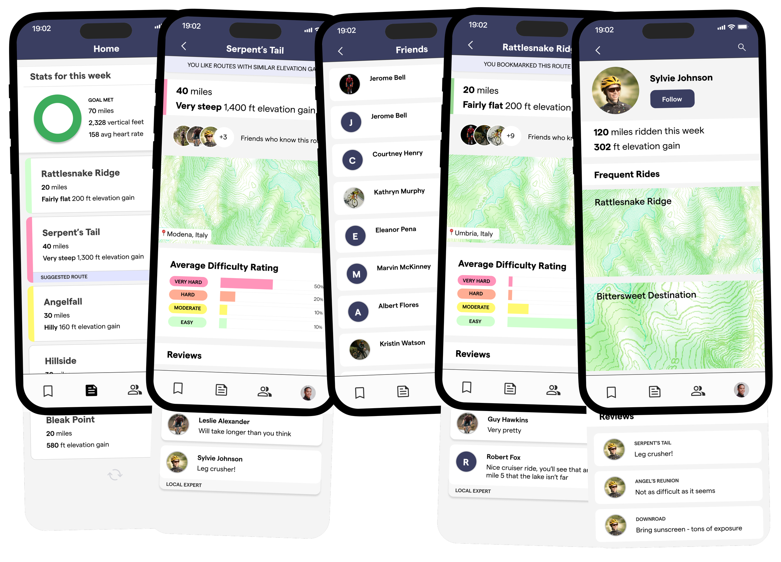
Spoke is a social community and tool for cyclists, with a focus on international travel.
Programs used
Figma
Persona development
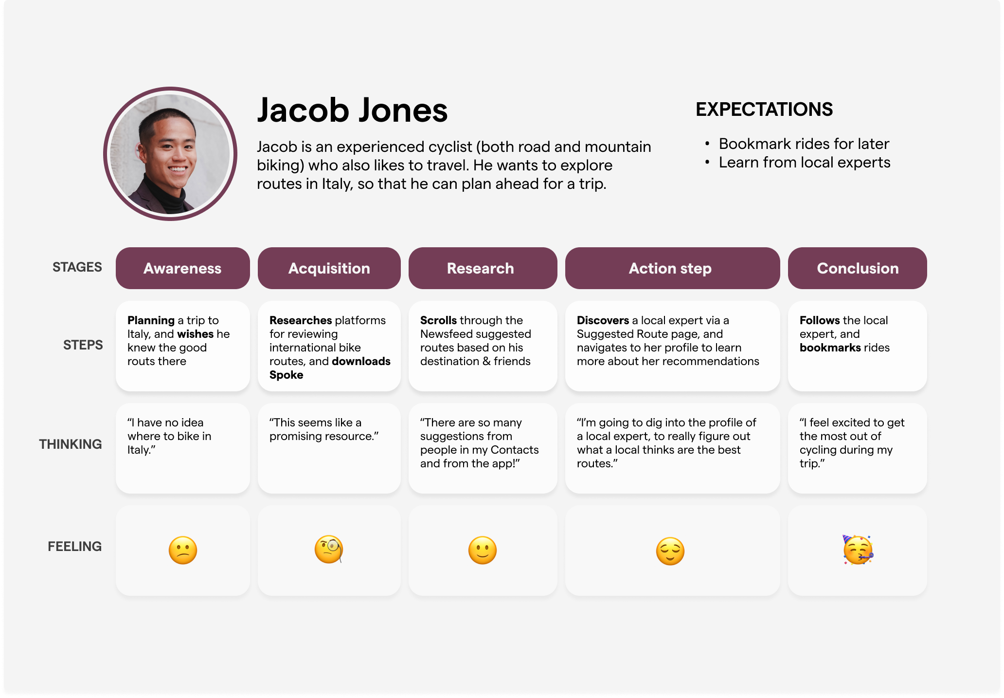
Let’s meet our user persona, Jacob Jones, and dive into his ideal journey. Jacob is an experienced cyclist (both road and mountain biking) who also likes to travel. He wants to explore bike routes in Italy so that he can plan ahead for a trip. His expectations of an app are that he can keep track of the rides he likes for later and that he will be able to access the expertise of local riders.
Wireframes
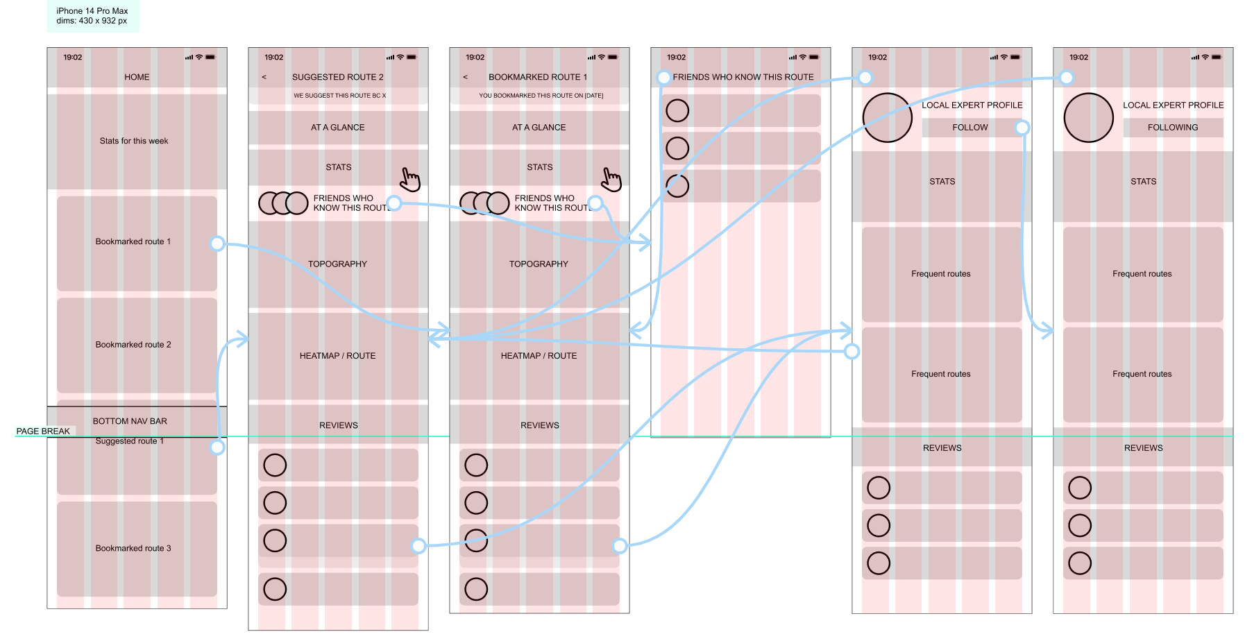
After thinking about the ideal user experience, I set to work on the low-fidelity wireframes, which I wanted to convey two journeys:
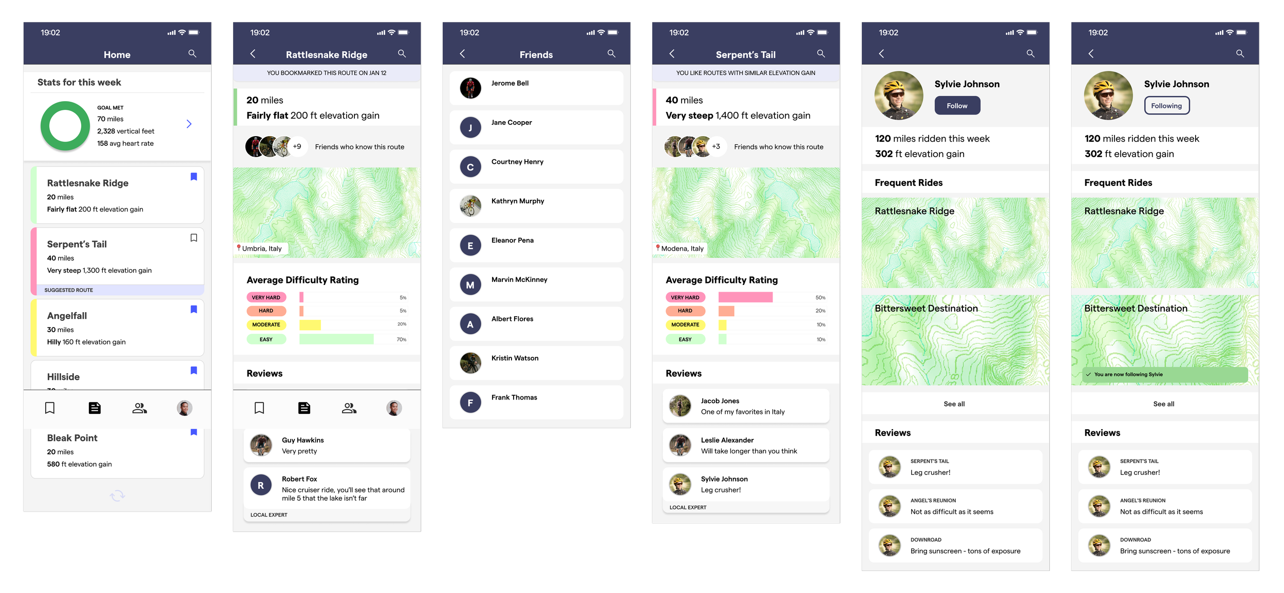
Following a local expert
Exploring which Friends are familiar with a certain route
Color System, Type Hierarchy, Components and Branding
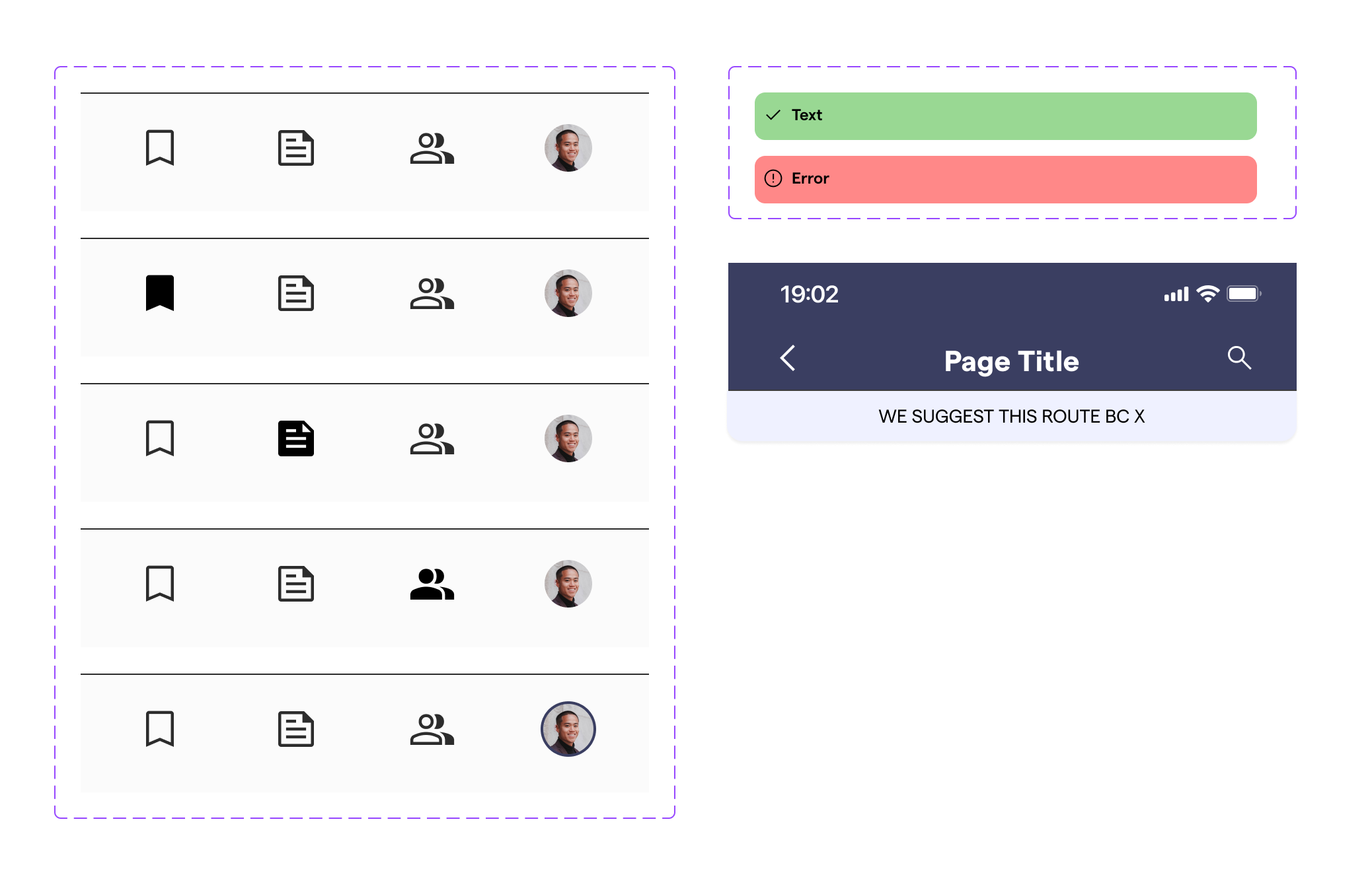
Before moving on to the high-fidelity mockup and prototype, it was time to design the color system and create any helpful components in Figma, based on the process of creating the low-fidelity wireframes. In this case, I decided to componentize the bottom navigation bar, top header, and snackbars.
The components utilize variants, boolean, and component swap properties. It was also necessary to design buttons, user cards, statistic cards, and topographical map visuals.
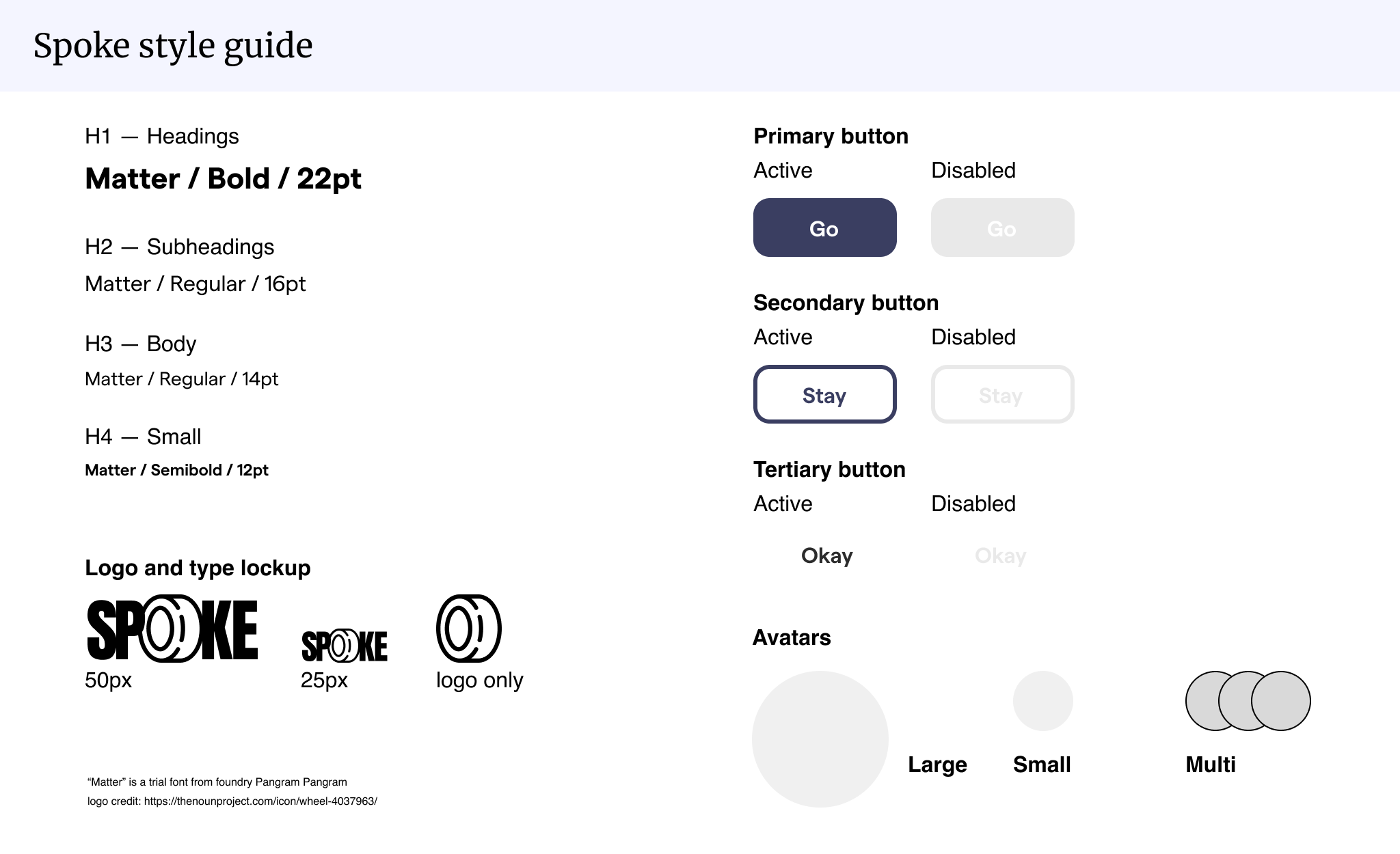
I also created a style guide including a type scale system, avatar sizing, a logo and type lockup. The style guide also includes 3 types of buttons in their active and disabled states.
High Fidelity Wireframe
Prototype
Here is the live prototype.
Improvements and Iterations
If I were to do this project again, these are some potential improvements that I could make & new features to incorporate in a more fleshed-out iteration:
The type system is simple, which I think is good, but I could have used an additional Heading size, and probably two more Subheading sizes, in addition to a Caption font —the Small size is not sufficient on its own.
I think the top-level navigation component/title could use more breathing room. On mobile, it is especially important to be cognizant of vertical height, but I think perhaps a 10 to 15 px increase could make a positive difference.
I want to add one-word tags to reviews (which would display as pills or badges) so that if a user doesn’t want to type out a comment, they can select from a few quick descriptors.
I need a user card component for user profiles to be used across reviews and friends lists.